


Color Blind Design: Crafting Inclusive Experiences
color blind
Color Blind
Color blind, or color vision deficiency, affects millions of people worldwide, impacting their ability to perceive and differentiate between certain colors. As UX/UI designers, it’s crucial to create inclusive designs that cater to the needs of all users, including those with color blindness. In this article, we’ll explore color blindness and discuss practical strategies for designing more accessible user experiences.
Types of Color Blindness
There are several types of color blindness, with varying degrees of severity. The most common forms include:
- Protanopia: Difficulty distinguishing between red and green hues.
- Deuteranopia: Difficulty differentiating green and red hues, similar to Protanopia but with a different cause.
- Tritanopia: Difficulty distinguishing between blue and yellow hues.
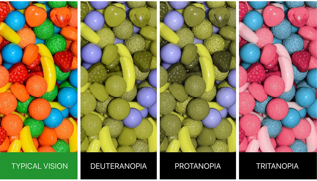
Understanding these types of color blindness can help designers create more inclusive interfaces by considering color combinations that are easily distinguishable for all users.
Designing for Accessibility


To design more accessible user experiences for color-blind users, consider the following strategies:
Color contrast:
Ensure sufficient contrast between text and background colors, making it easier for users to read and comprehend content. Use tools like WebAIM’s Color Contrast Checker to verify adequate contrast ratios.
Color palettes:
Choose color palettes that are color-blind friendly. Avoid problematic color combinations, such as red and green or blue and yellow. Opt for high-contrast colors and shades that are easily distinguishable.
Use of patterns and textures:
Supplement color-coding with patterns, textures, or icons to convey meaning. This way, users can rely on visual cues other than color to understand the interface.
Text labels:
Use text labels in conjunction with color-coded elements, such as buttons or status indicators, to reinforce meaning and improve accessibility for color-blind users.
Testing:
Test your designs with color blindness simulators or real users to ensure accessibility and gather feedback for improvements.
By incorporating these strategies into your design process, you can create more accessible and inclusive user experiences for color-blind individuals, ensuring that your products and services cater to a broader audience.


The Importance of Designing for Color Blind Users
Designing for color blind users is essential for several reasons, including:
Inclusivity:
Approximately 1 in 12 men and 1 in 200 women globally have some form of color blindness, amounting to millions of people. By designing with their needs in mind, we create more inclusive products and services that cater to a diverse audience. Failing to consider their needs may result in exclusion and frustration for a significant portion of users.
Accessibility:
Designing for color blindness is part of a larger commitment to accessibility, ensuring that people with disabilities or impairments can access and use digital products effectively. Accessibility is not only an ethical responsibility but is also required by law in many jurisdictions under web accessibility standards such as the Web Content Accessibility Guidelines (WCAG).
Usability:
Designing for color blind users often leads to improved usability for everyone. By emphasizing clear visual cues, high contrast, and easy-to-understand interfaces, designers create more user-friendly experiences that benefit all users, regardless of their color vision abilities.
Brand reputation:
Companies that prioritize inclusivity and accessibility demonstrate their commitment to social responsibility and user satisfaction. This can lead to increased customer loyalty, positive word-of-mouth, and an enhanced brand reputation.


By understanding the importance of designing for color blind users and implementing inclusive design practices, designers can create user experiences that are not only accessible and enjoyable for color blind individuals but also more user-friendly and effective for all users.
An essential step in designing for color-blind users is to test your designs for accessibility. One useful tool for checking color blindness compatibility is coblis – color blindness simulator (Tool link). This tool allows you to simulate how your designs will appear to users with different types of color blindness, helping you identify and address potential issues in your color scheme and overall design.

Read recent articles
What Drives Us to Share on Social Media?
The Concept of Simplicity
Human-Centered Design: Solutions for Human Needs