


The Concept of Simplicity
Simplicity is about making things clear, easy, and comfortable. But we need to be careful not to take simplicity too far. When we go too extreme or misuse simplicity, it can actually harm the design or have the opposite effect of what we intended. It’s important to find the right balance and not overdo it when simplifying things.

What is?
Simplicity is all the rage these days. It is a design philosophy that is championed by many successful companies and fans of those companies alike. Apple Inc., a highly successful multinational technology company, fights for simplicity in design. Steve Jobs, the late CEO of Apple, an American entrepreneur and investor, once said:
“That’s been one of my mantras — focus and simplicity. Simple can be harder than complex. You have to work hard to get your thinking clean to make it simple. But it’s worth it in the end because once you get there, you can move mountains.”
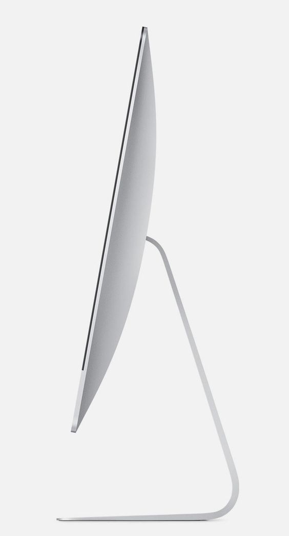
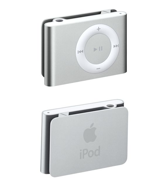
Users of all ages love the Apple MacBook. This is an example of how simplicity reduces intimidation and allows a wider range of users to be unafraid to use the product. When you ask someone why they love their Apple iPhone or Apple MacBook, you usually get the answer similar to this: “Because it’s simple!”. When you probe further, most fans and users of the product can’t really explain how and why it’s simple. To them, “It just works.” as Steve Jobs would say. Simplicity is not easy to define or measure. Joe Sparano, an American graphic designer and design educator says it:
“Good design is obvious. Great design is transparent.”
Designing a user interface that considers the user’s aims, whether vast or few and offers the simplest means of achieving these goals, is the height of design sophistication. Simplicity in design isn’t just about the minimal colors you use or the whitespace you include, it’s about going deep into your user’s minds and using that understanding to design a product that rids itself of inconsequential elements and closes the gap between the user’s goals and the means to achieve those goals through your system.

Simplicity is Difficult
The concept of simplicity is no easy task. Defining the core of something can be a challenging endeavor. Let’s consider this blog post as an example. What truly defines its essence? Perhaps it’s the content itself. But does that mean everything surrounding the actual post should be eliminated?
Should the publication date be deemed essential?
What about the categories and tags associated with it?
Or the breadcrumb navigation?
The main navigation?
Should my name as the author be included?
What about the comments section?
And what about my logo or the ads?
Whether right or wrong, I made the decision that the aforementioned elements were essential when I designed the template for blog posts on this site. I initially had more elements but gradually reduced them to what you see now. However, I still question whether I have truly achieved my goal of simplification. How much more can I safely remove? Did I lack the courage to eliminate something that isn’t truly essential?
Determining what is essential often depends on the specific context of the design. If it’s solely for this particular post, global navigation may not be considered essential. However, if it’s for the entire site, global navigation becomes a crucial element.
In design, it is easy to find justifications for everything you add. You may believe that you are designing something more complex than what it actually is. You can make a case for the inclusion of almost anything. However, achieving simplicity requires designers to go the extra mile. It demands significant effort to refine and continually evaluate in order to eliminate what is non-essential. Simplicity is difficult because it constantly challenges you to assess whether the thing you are designing truly aligns with its essence. If you veer off track, simplicity suggests discarding your work and starting anew.
Achieving simplicity in our designs
John Maeda’s 10 Laws of Simplicity
This is John Maeda’s 10 laws of simplicity. Here are the rest. I encourage you to read John’s book. It’s a great read and it’s a book that belongs on a shelf in every designer’s library.
- Reduce — The simplest way to achieve simplicity is through thoughtful reduction
- Organize — Organization makes a system of many appear fewer
- Time — Savings in time feel like simplicity
- Learn — Knowledge makes everything simpler
- Differences — Simplicity and complexity need each other
- Context — What lies in the periphery of simplicity is definitely not peripheral
- Emotion — More emotions are better than less
- Trust — In simplicity we trust
- Failure — Some things can never be made simple
- The One — Simplicity is about subtracting the obvious, and adding the meaningful.

Maintain Clarity: Understand and Design for Users’ Main Goals
Whether your website serves as an online retailer for consumers or your product is an enterprise solution for managing projects, maintaining clarity in your user interface design is crucial for user success and satisfaction. Clarity enables users to grasp what you’re helping them achieve. If your design overwhelms users with extraneous information, they will struggle to navigate your site. Within the first few seconds of browsing, ensure that users understand the message you’re conveying and the actions they can take. Direct their attention to the core aspects of the page that align with their goals.
For example, Google’s search engine interface, with its singular focus on search, outperformed competitors like Yahoo by providing a clear user interface that aligns with users’ search goals. In contrast, Yahoo’s homepage, overloaded with various elements, diverts users’ attention and fails to align with their search objectives.
Remember: Design for your users’ main goals by maintaining clarity. Avoid confusing users with irrelevant information and guide their attention to the core aspects you want them to focus on.

Make Use of Automation: Design for Minimum Cognitive Effort
According to cognitive scientists Walter Schneider and Richard Shiffrin, well-rehearsed behaviors become “automatic.” This means that humans can perform common, practiced tasks with minimal conscious cognitive effort. Consider a simple example like a toaster, which has seen little change over the years. It is easy to use and requires few interactions to achieve appliance-related goals. Interacting with such a familiar and automated device instills a sense of ease and control without demanding much effort.
Another example is messenger apps, which exhibit similar appearance and functionality across different mobile interface designs. By leveraging existing customs and designs, users can easily adapt to different messenger apps due to their familiar interfaces and common functionality.
Remember: Design for automation by minimizing cognitive effort. Identify commonly practiced tasks and incorporate them into your designs whenever possible.
Limit Options: Design for a Strong “Information Scent”
Ed Chi, a respected computer scientist and research scientist at Google, identified our tendency to detect only relevant information when pursuing our current goal. This concept, known as “following the scent of information,” is crucial for guiding users through a desired path with clear indications of the individual steps needed to accomplish their goals. To establish a strong information scent, your displays should be uncluttered, centralize essential information, and provide clear guidance.
Limiting options in your user interface removes indecision, confusion, and overuse of the back button. Many apps and widgets focus on users’ key goals, streamlining the design process. For instance, consider a weather widget that eliminates unnecessary elements found on a typical weather-reporting website. The widget designer understands that users primarily seek key weather information, such as temperature, and the ability to change locations through settings.
Remember: Limit options to create a strong information scent. Eliminate unnecessary choices that cause confusion and hesitation, allowing users to achieve their goals faster and more efficiently.
Reduce the Gulf of Execution: Demonstrate How Your Product Helps Users Achieve Goals
In the book “The Design of Everyday Things” by Don Norman, a renowned design thinker, the term “gulf of execution” refers to the gap between a user’s goal and the means to execute that goal within a system’s interface. The user interface should match users’ psychological goals as they evaluate the system’s limitations and capabilities. The easier it is for users to perceive how to accomplish their goals through the system, the narrower the gulf of execution. A wide gulf of execution increases the likelihood that users will abandon your product.
Comparing a weather website to a weather widget demonstrates how a simpler user interface can lead to a narrower gulf of execution. A weather widget provides a straightforward and direct means of accessing weather information, while a weather website offers more varied and potentially distracting means.
To narrow the gulf of execution, design systems with users’ primary goals in mind, considering the limits of human memory and attention allocated to each goal.
Remember: Aim for a narrow gulf of execution. Make it clear to users how they can interact with your user interface to achieve their goals. Design your product as a simple tool for users to understand and utilize.
By applying these principles of simplicity, you can create user-friendly experiences that cater to your users’ goals. Remember to maintain clarity, leverage automation, limit options, and reduce the gulf of execution. Embrace simplicity as a design philosophy, and your users will appreciate the straightforward and intuitive nature of your products.
Simplicity isn’t just a visual style. It’s not just minimalism or the absence of clutter. It involves digging through the depth of complexity. To be truly simple, you have to go really deep.…You have to deeply understand the essence of a product in order to be able to get rid of the parts that are not essential.
—Jony Ive
Importance of Simplicity
Simplicity is important because it makes things easier to use and understand. According to a poll conducted in 2002, 87% of people believed that ease of use is the most crucial aspect of new technologies. While simplicity doesn’t guarantee usability, it generally makes designs more user-friendly. When there are fewer options to choose from, decision-making becomes less complex. Simple designs are often more visually appealing and accessible. They enable us to accomplish tasks more quickly, easily, and efficiently. Simplicity also reduces the need for extensive instructions and support. For example, services like Instapaper and Readability are popular because they remove unnecessary elements from websites and present content in a simpler format, making it easier to consume.

Read recent articles
What Drives Us to Share on Social Media?
Inspiration Unleashed: Breaking Boundaries
Color Blind Design: Crafting Inclusive Experiences
Human-Centered Design: Solutions for Human Needs